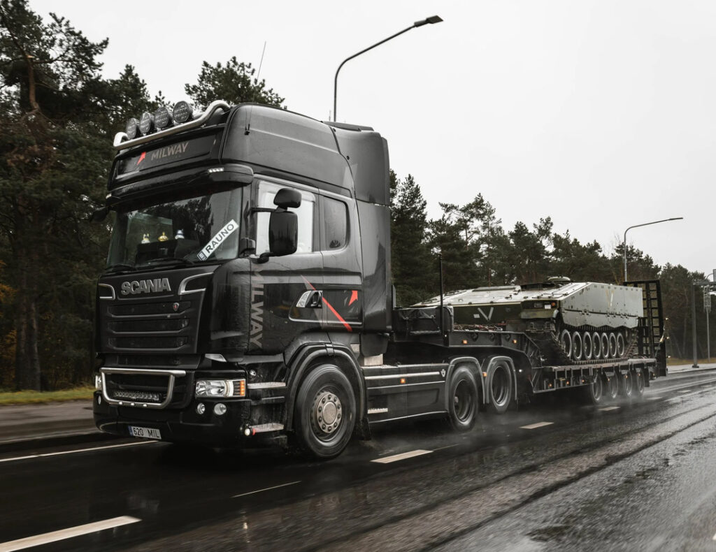
Milway is an Estonian logistics and transportation company specializing in complex and high-security transport solutions across Europe. Their services range from oversized cargo and express transport to military, strategic, and ADR-classified goods, including explosive materials.
With a strong focus on precision, safety, and reliability, Milway provides tailored logistics solutions across land, sea, and air transport – combining technical expertise with modern tracking systems and detailed operational planning.
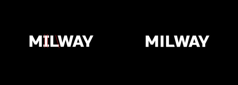
The branding for Milway was developed around clarity, reliability, and a contemporary industrial identity. The visual direction combines clean typography, structured layouts, and minimal graphic elements to create a system that feels professional, adaptable, and grounded within the company’s technical field.
The overall identity aims to balance functionality with a modern visual language — building trust while maintaining a strong and recognizable presence across digital and printed applications.