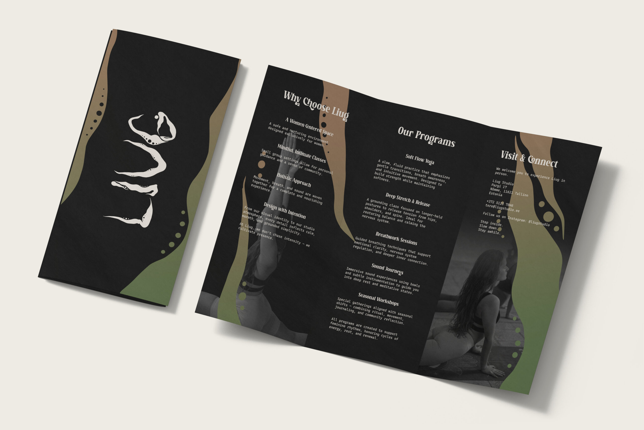
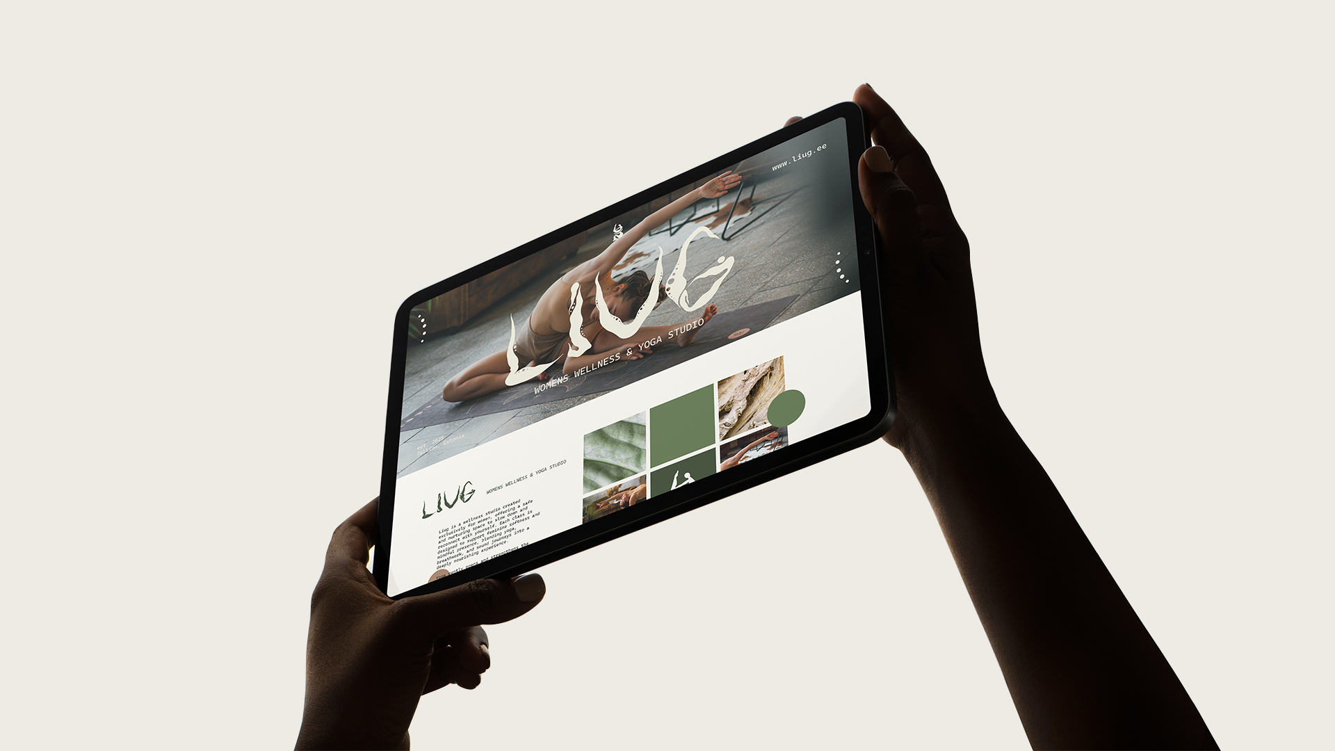
Liug is a women-only wellness studio created as a safe, nurturing space to slow down and reconnect with yourself. Each class is thoughtfully designed to support feminine softness and mindful presence, blending yoga, breathwork, and sound journeys into a deeply restorative experience.

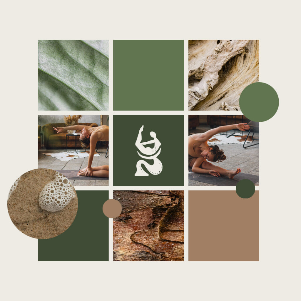
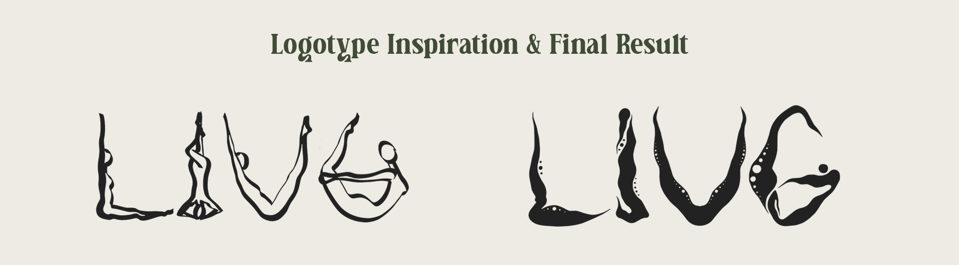
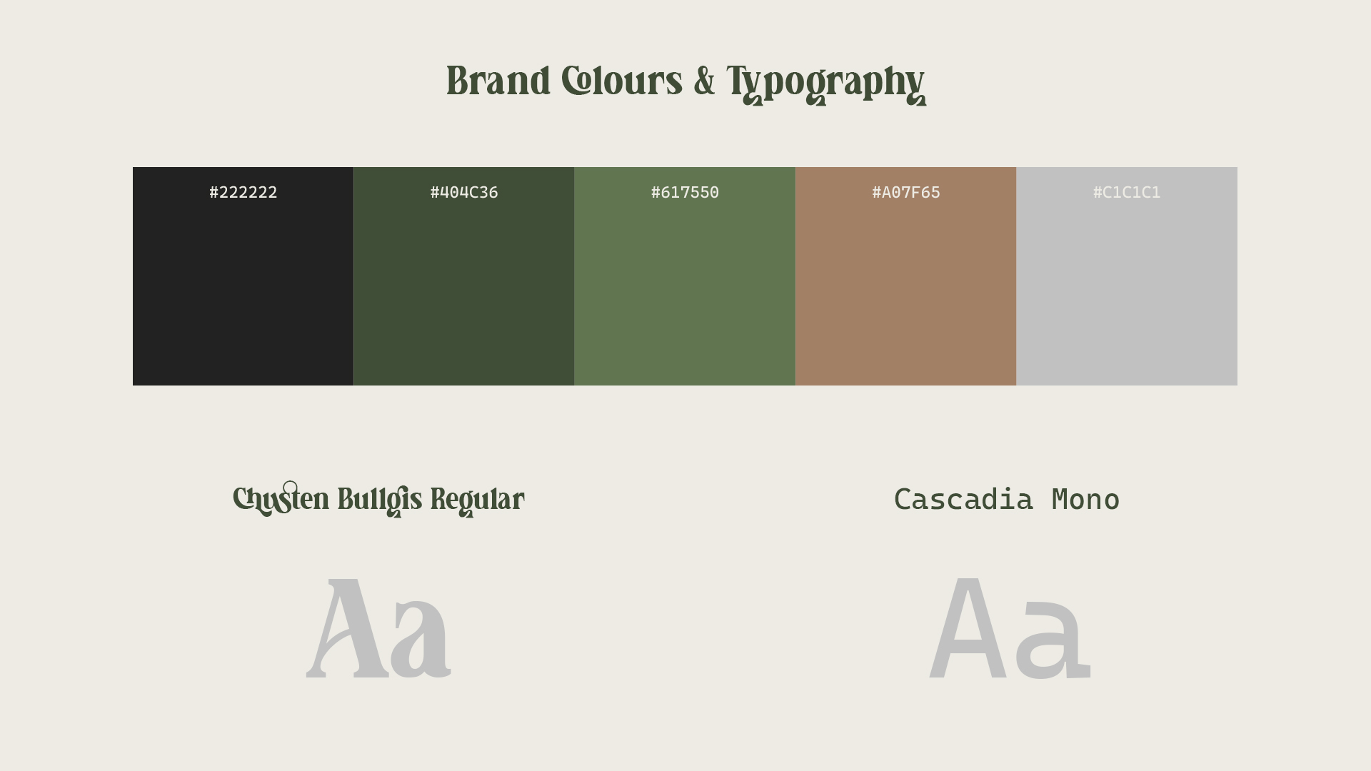
The visual identity was developed as an extension of this philosophy. A fluid custom typeface, created in collaboration with Estonian artist Lila Rasa, reflects movement, gentleness, and flow. The minimalist icon — a woman in a yoga pose — symbolizes strength held in softness. The color palette draws from nature’s quiet textures: tree bark, leaves, sand, and clay, grounding the brand in earthy calm and subtle warmth.

Fluidity & Movement
The custom letterforms feel organic and almost liquid, mirroring the meaning of Liug (to glide/flow). The shapes resemble sea plants or gentle waves, reinforcing softness and continuous motion — directly aligned with the studio’s focus on slowing down and moving mindfully.

Feminine Strength
The letters subtly echo the curves of the female body. They are strong yet soft — bold silhouettes without sharp aggression. This balance reflects the studio’s philosophy of strength held in softness.

The brand palette is rooted in soft, earthy neutrals inspired by bark, sand, and clay, with #edebe4 (ivory) used for backgrounds and lighter text to create a calm, breathable foundation that enhances the sense of warmth and quiet minimalism.

To support the fluid custom wordmark, Chusten Bullgis Regular is used for headings, echoing the logo’s soft curves and expressive character. Cascadia Mono is used for body text, adding clean structure and calm readability. Together, they balance softness with clarity, reinforcing the brand’s grounded yet feminine tone.