Sebastian Hex is an electronic music producer with a strong interest in technology, virtual reality, and digital culture. His artistic direction combines futuristic aesthetics with immersive electronic music, resulting in a project that sits somewhere between club culture, innovation, and speculative worlds.
The visual identity for Sebastian Hex was built around themes of duality, technology, virtual worlds, and continuous evolution. These ideas informed both the logo design and the broader visual language developed for the project.
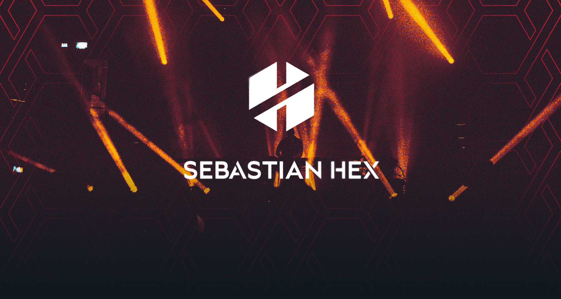
The logo itself takes the form of a hexagon – a direct reference to the artist’s name – while subtly incorporating the letters H and X. The H is immediately visible, while the X emerges through the use of negative space, rewarding a closer look. A diagonal cut divides the symbol into two balanced halves, reinforcing the theme of duality while suggesting movement, progression, and constant refinement.
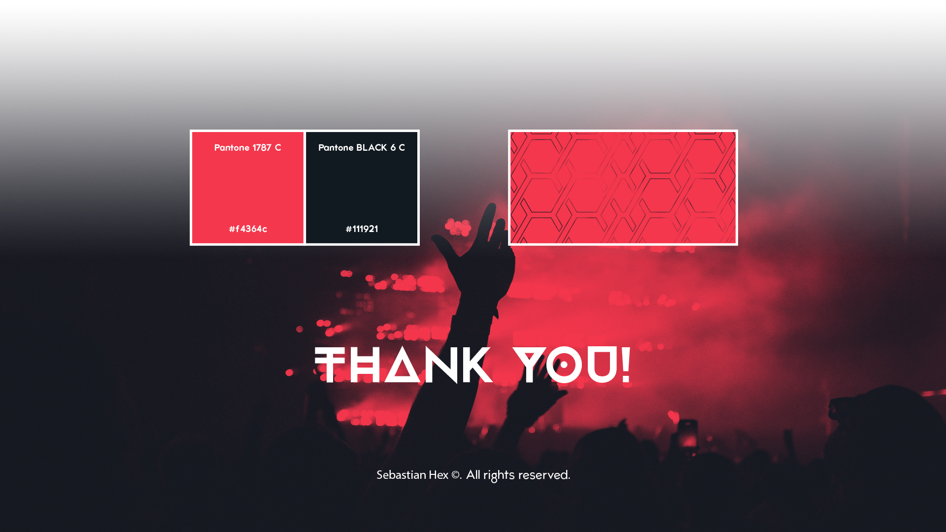
An earlier concept explored the X as the central element of an infinity symbol connected to two hexagons, creating a paradoxical form inspired by virtual reality and impossible geometry. While the final logo evolved into a more abstract and versatile mark, this concept remains present throughout the visual identity as a repeating graphic pattern and supporting design element.